In M-Files versions 2015 and later, you can use a graphical tool for creating and modifying workflows. The designer is an integral part of M-Files Admin. You can access the designer by selecting your vault connection from the left-side tree view and by navigating to Workflows.
Workspace
- The top section lists the available workflows and the task area commands New Workflow, Make Copy, Delete and Properties.
- The bottom section displays the graphical workflow designer. The designer-related task pane commands are explained under Using the designer and Task pane commands.
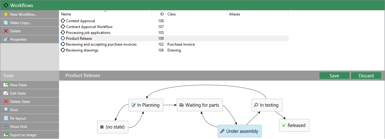
The graphical workflow designer in M-Files Admin.
The Save and Discard commands are located in the top-right corner of the workspace, on the title bar of the selected workflow. The Save command covers all the modifications to the workflow, including the layout of your graphical representation.
You can modify the workspace proportions by dragging the workflow title bar up or down.
Using the designer
The designer has been designed to work very intuitively. You can use the task area and/or interact with the graphical designer and context menus.
Creating new states
You can create new states either via the task area or by double clicking an empty space on the canvas. This opens up the dialog for a new workflow state.
Editing states
You can open the properties dialog for an existing state simply by double clicking the state, by selecting it and then clicking Edit State via the task area, or via the context menu for the state.
Deleting states
States can be deleted via the task area command Delete, via the state's context menu, or by selecting the state and pressing the Delete key on your keyboard.
Modifying the layout
The workflow states can be freely moved around on the canvas by dragging and dropping.
Connectors (state transitions)
You can add arrow connectors between the states by moving your cursor on the edge of a state rectangle and by using drag and drop. The state rectangle has green edges and the cursor changes into a cross (+) when a connector can be drawn. The connectors represent workflow state transitions.
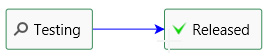
A state transition being drawn from "Draft" to "Released".
Sometimes the connectors may overlap with each other or with the state rectangles. The connectors can also be modified to make the layout more readable. Just select a connector and use the two handles for re-shaping the connector.
The context menu for a connector allows you to Edit or Delete the state transition in question, as well as to Straighten the connector. Double clicking the connector opens the properties dialog for the state transition.
Zooming and dragging the canvas
You can zoom in and out by scrolling, as well as drag the canvas around. The context menu for an empty space on the canvas allows you to reset the zoom level.
Task pane commands
In addition to context-specific task area commands, such as Edit State or Straighten, there are also a few actions that affect the designer or your workflow as a whole.
Re-layout
With the Re-layout command you can "clean up" the canvas. This basically makes M-Files suggest a default positioning for the workflow components.
Show Grid
The Show Grid command toggles the grid shown on the background.
You can create a paper copy of the workflow by using the Print command on the task area.
Export as Image
In addition to creating a print-out, you can export the workflow as a PNG file. Clicking the Export as Image command opens the common Windows save dialog for the image file.
Tooltips
The state rectangles and connectors may display a tooltip while the cursor is hovered above them.
In addition to the title of the element, the tooltips may contain a description as well as information on the state transition conditions and special actions related to the transition or workflow state.